Demo
Pipeline output demo
Everything on this page was generated by the Decoder and Traceroute pipeline from a single EEG recording — topographic maps, z-score sheets, source localization, connectivity, interactive dashboards, and structured text reports — the same pipeline that runs for every client session.
From Recording to Report
1. Acquire
19-channel EEG recorded with eyes open and eyes closed. The raw signal is the single input to the pipeline.
2. Process
The Decoder applies artifact rejection, spectral analysis, normative comparison, source localization, and network analysis — all configuration-driven and reproducible.
3. Report
Structured outputs — topomaps, z-score sheets, LORETA views, Network Intelligence reports, and interactive Traceroute dashboards — delivered as a complete package.
Same input data and settings produce the same output every time. The pipeline is deterministic — nothing is manually adjusted between runs.
Quantitative Topographic Maps
Scalp topomaps project power values, z-scores, and condition differences onto a top-down head diagram. They are the standard visualization in quantitative EEG — giving clinicians an immediate spatial view of where brain activity is concentrated, how it compares to norms, and how it changes between conditions.
Z-Score Summary Sheet
Three rows of scalp topomaps: absolute power z-scores, relative power z-scores, and amplitude asymmetry — each broken out by Delta, Theta, Alpha, Beta, and Hi-Beta. Z-scores reference a normative database so clinicians can quickly see where a recording deviates from population norms. Red indicates above-norm; blue indicates below-norm.
Band Power Topomaps
Seven side-by-side scalp maps (Delta through Hi-Beta) showing absolute band power distribution during the eyes-open condition. Each map uses the same color scale so you can compare which regions carry the most power in each band — useful for identifying dominant rhythms and regional asymmetries.
Alpha: Eyes Open vs Eyes Closed
Side-by-side alpha-band topomaps comparing EO and EC conditions. The classic alpha reactivity pattern — posterior alpha increasing when eyes close — is one of the first things clinicians look for. This paired view makes the comparison immediate without flipping between separate maps.
EO – EC Difference Map (Alpha)
A single difference topomap subtracting EC values from EO. Regions in blue show where alpha power decreased in EO relative to EC (expected in posterior regions); red would indicate the opposite. Difference maps condense a two-condition comparison into one image, making regional shifts easy to spot.
Spectral & Temporal Analysis
Beyond topomaps, the Decoder produces per-channel power spectra, a ClinicalQ reference grid, and time-domain vigilance analysis. These outputs let clinicians drill into the frequency content at each site and understand how arousal state varied across the recording.
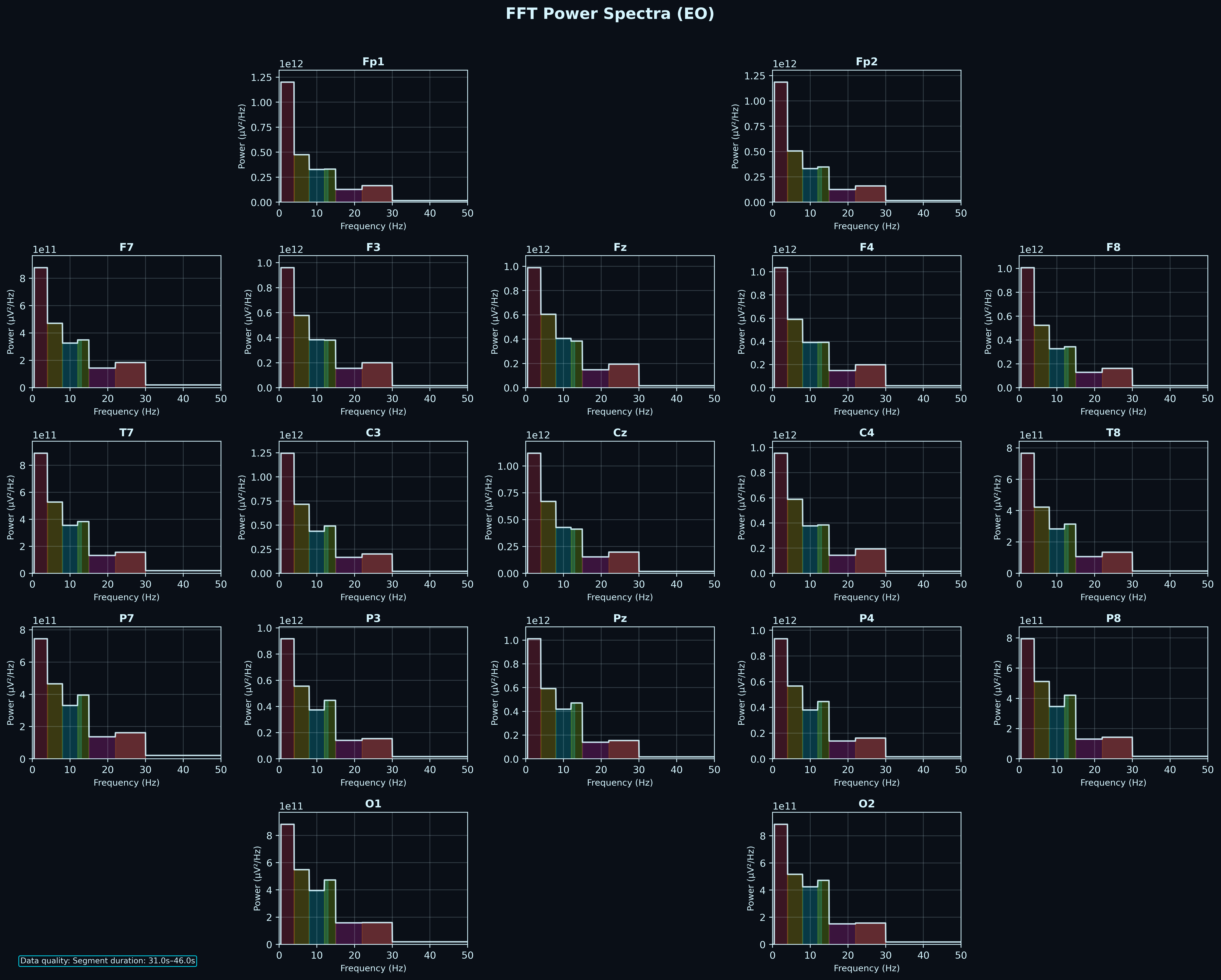
FFT Power Spectra (All Channels)
Per-channel power spectral density plots arranged in the standard 10-20 montage layout. Each subplot shows the distribution of power across frequency bins, color-coded by band. This is the raw spectral fingerprint of the recording — clinicians use it to identify peaks (e.g. posterior alpha peak), broadband elevations, or unusual spectral shapes.
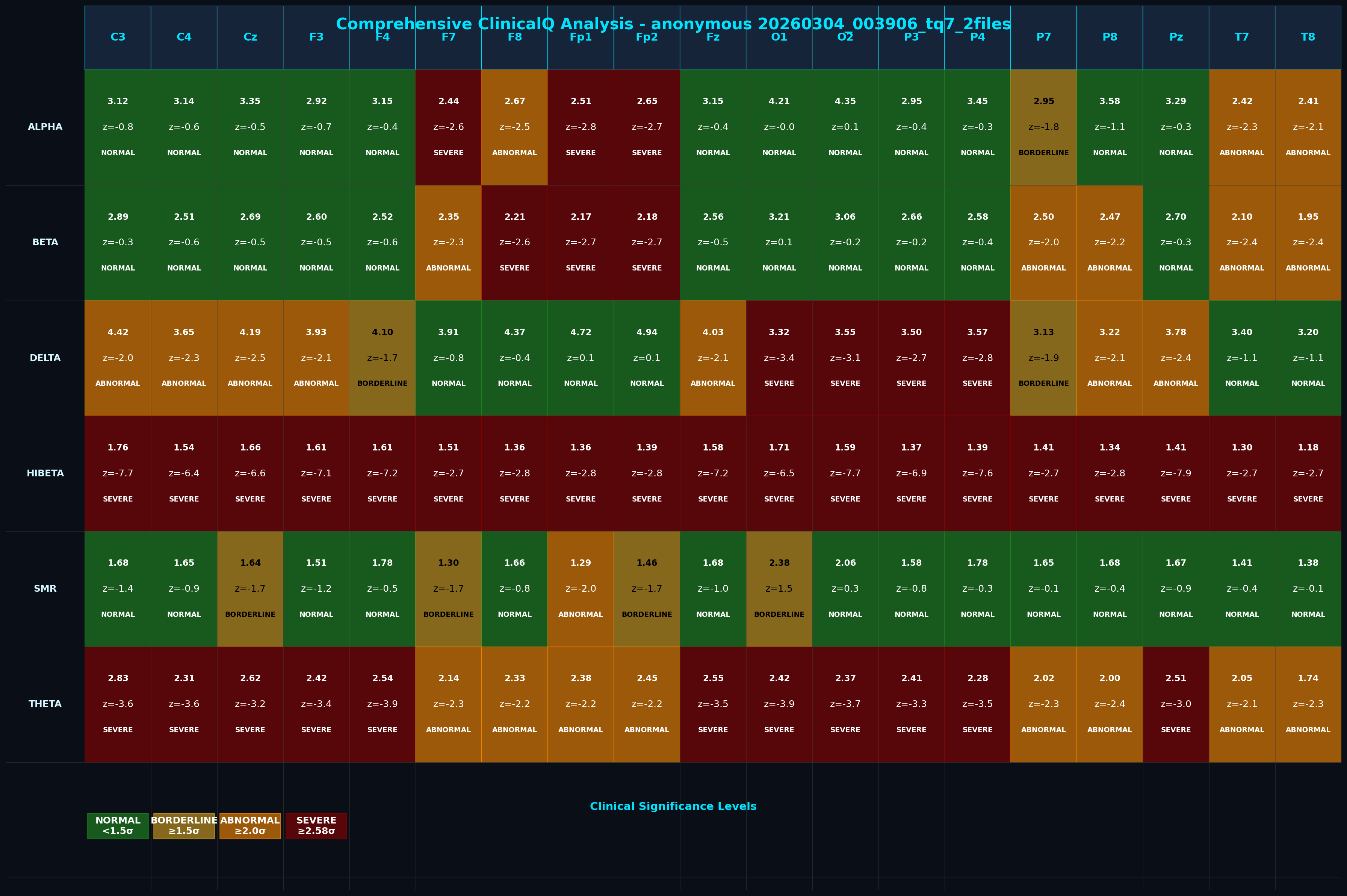
ClinicalQ Analysis Grid
A channel-by-band matrix reporting absolute power, z-score, and clinical significance level (Normal, Borderline, Abnormal, Severe) for every electrode in every frequency band. Color-coded cells let a clinician scan the entire recording at a glance and identify which sites and bands fall outside normative ranges.
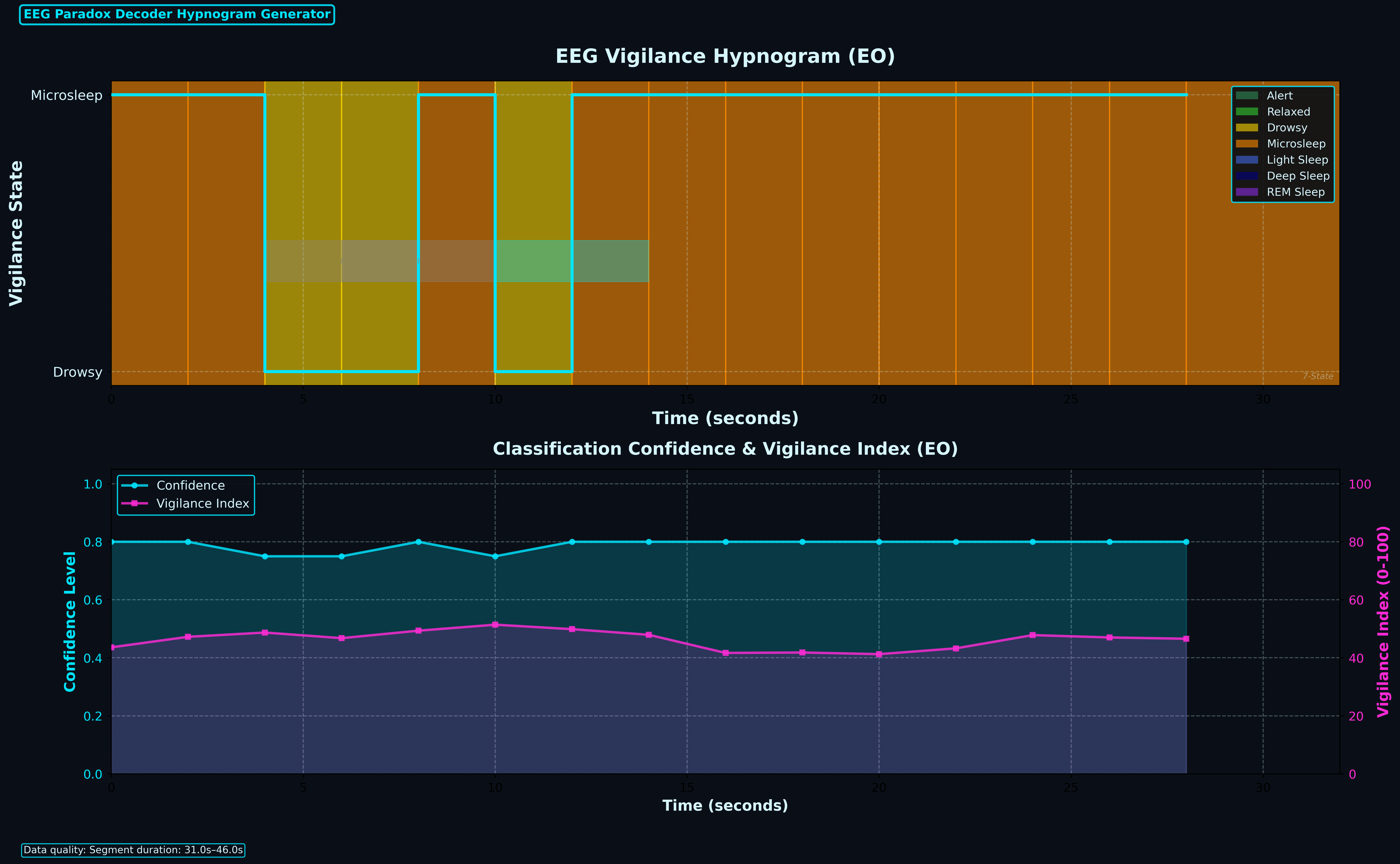
Vigilance Hypnogram
Two-panel chart: the top panel shows epoch-by-epoch vigilance state classification (Alert, Relaxed, Drowsy, Microsleep, etc.) across the recording. The bottom panel tracks classification confidence and a continuous vigilance index. Together they quantify how stable attention was throughout the session — useful for artifact screening and understanding recording quality.
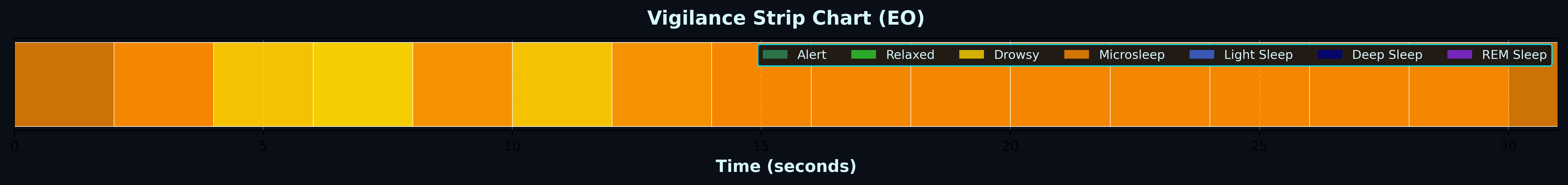
Vigilance Strip
A compact timeline of vigilance states for the full recording. Each color segment represents a classified state. This strip is designed to sit alongside other outputs to provide an at-a-glance arousal context — helpful when reviewing topomaps or spectra to know what the participant was doing at each point.
Source Localization (LORETA)
LORETA (Low Resolution Electromagnetic Tomography) estimates where cortical generators are located based on scalp EEG. The Decoder runs three LORETA variants (LORETA, sLORETA, eLORETA) and produces 3D renderings, slice views, connectivity maps, and a multi-panel research viewer. These help localize activity to specific brain regions — going beyond the surface-level view that topomaps provide.
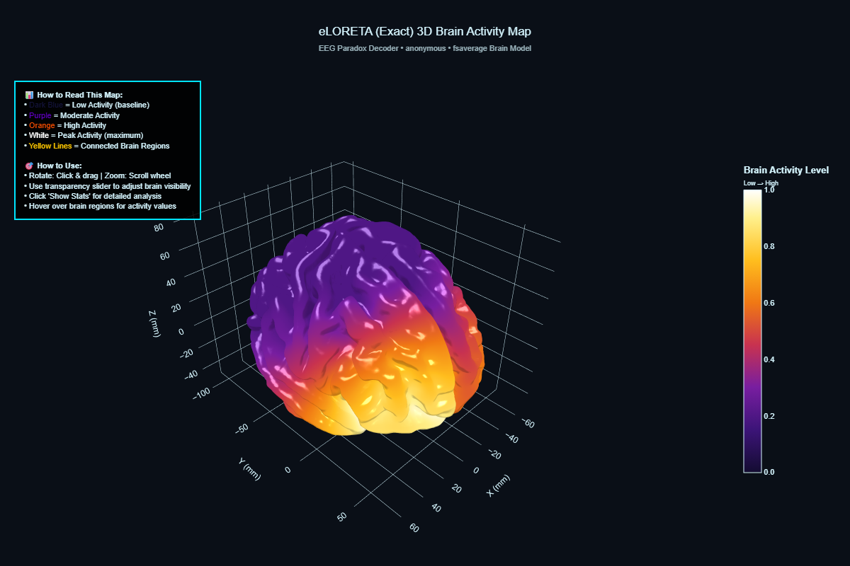
eLORETA 3D Brain Activity Map
Source-localized activity projected onto a 3D cortical surface model. The Decoder uses eLORETA (exact Low Resolution Electromagnetic Tomography) to estimate where cortical generators are located based on the scalp EEG. The color gradient shows activity intensity — purple for baseline, through orange to white for peak activity regions.
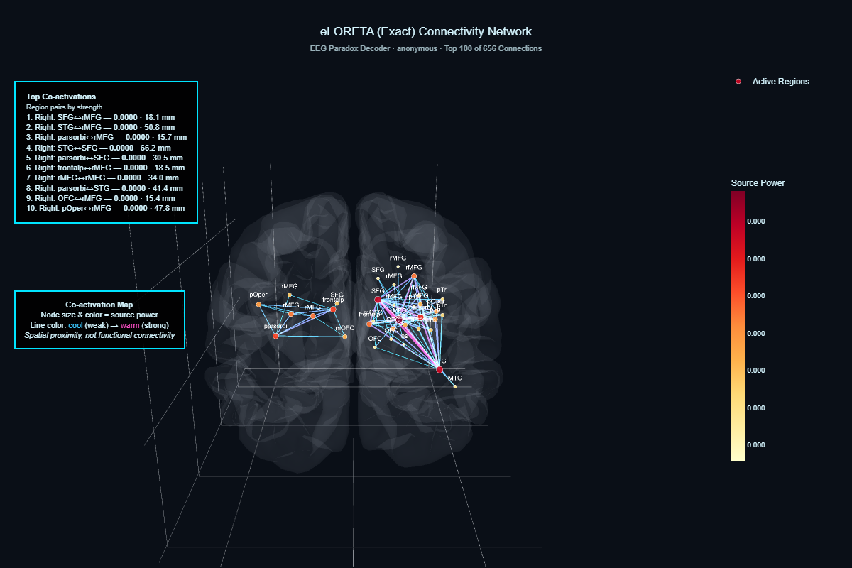
Source Connectivity Network
A co-activation map overlaid on a transparent brain model. Each node is a cortical region sized by estimated source power. Lines between nodes represent co-activation strength (cool colors = weak, warm colors = strong). The sidebar lists the top co-activating region pairs by strength. This is spatial proximity co-activation, not functional connectivity — it shows which source regions tend to be active together.
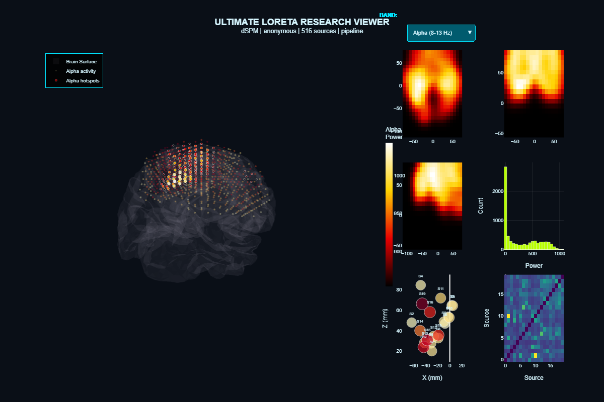
LORETA Research Viewer (7-Panel)
A multi-panel research view combining the 3D source model, axial/sagittal slice heat maps, power distribution histogram, source scatter plot, and a source-by-source correlation matrix. This is the most detailed source-level output the Decoder produces — designed for researchers or clinicians who want the full picture of cortical source estimation in one view.
Structured Text Reports
Every Decoder run produces a full set of structured text reports — each designed for a different audience and purpose. Clinical summaries for quick review, comprehensive analyses for deep dives, ClinicalQ scorecards for neurofeedback practitioners, protocol suggestions for training decisions, and systems-level views for network analysis. Below are all 16 report types from this demo run, organized by category.
Click any report to view it as a fully formatted page. These are the actual reports the pipeline generated — sanitized for demo use but otherwise unmodified. Raw TXT downloads are available from each report page.
Clinical Reports
Clinical Summary Report
Clinicians
High-level clinical snapshot: primary network affected, pattern severity, clinical buckets, regulatory load, and network-level findings. Designed to give a clinician the key picture in the first page.
Master Clinical Report
Clinicians
Network-by-network analysis (frontal, central, parietal, temporal, occipital) with health scores, functional impact assessment, and global systems overview.
Clinical Narrative Report
Clinicians, referring physicians
Prose-format narrative of findings — background rhythm description, clinical observations by network. Suitable for clinical notes or referral letters.
Clinical Hypothesis Report
Clinicians, psychologists
Links detected EEG patterns to symptom domains (attention, mood, impulsivity, social cognition). Ranks domains by strength and generates testable clinical hypotheses.
Classical qEEG Report
Clinicians, referring physicians
Formal qEEG report format: patient identification, key findings summary, technical recording details, and additional site-by-site findings.
Comprehensive Analysis Report
Clinicians, researchers
The most detailed report — every detected condition, norm violation, and metric finding. In this demo run: 145 conditions checked, 38 norm violations flagged.
Printable Summary
Clinicians, clients
Condensed summary: key statistics, executive summary, top findings, and primary treatment targets. Designed for handouts or quick reference.
ClinicalQ & Markers
ClinicalQ Assessment Report
Neurofeedback practitioners
Multi-site ClinicalQ assessment with z-scores and severity levels per site, epoch, and metric. Full Swingle-style multi-site analysis for EO and EC conditions.
Swingle 23-Marker Scorecard
Swingle-trained practitioners
The 23 key ClinicalQ markers formatted as a scorecard with range definitions, severity levels, and out-of-spec flags.
EEG Marker Summary
Clinicians, technicians
Data quality assessment and summary statistics for alpha, beta, theta, delta, and derived ratios at every channel.
Protocol & Treatment
Protocol Suggestions Report
Neurofeedback practitioners
Neurofeedback protocol suggestions derived from detected patterns and mapped to Swingle and Gunkelman frameworks. Includes priority rankings and monitoring recommendations.
Protocol Flow Analysis
Technicians, pipeline operators
Technical report on how the pipeline processed the recording: protocol detection, processing timeline, compliance checks, and decision flow.
Hybrid Report
Neurofeedback practitioners
Combined clinical and technical report: quick reference card, global EEG summary, vigilance data, site metrics, connectivity, and protocol recommendations in one document.
Systems & Vigilance
Brain Systems Analysis Report
Clinicians
Network-level systems view: frontal, central, parietal, temporal, and occipital networks analyzed for health scores, regulatory efficiency, and cross-network interactions.
Vigilance-Phenotype-State Report
Clinicians, researchers
Vigilance state classification using a 7-state model (V0–V6), regional vigilance breakdown, stability metrics, and phenotype correlations.
Master Snapshot
Clinicians
Quick-reference clinical snapshot: top clinical flags, dominant functional state, primary networks affected, and initial clinical direction.
How these reports work together
The Decoder produces all of these reports from a single processing run. A clinician might start with the Printable Summary or Master Snapshot for a quick overview, then drill into the Clinical Summary or Systems Analysis for network-level detail. Neurofeedback practitioners use the ClinicalQ Assessment, Swingle 23-Marker Scorecard, and Protocol Suggestions to inform training site selection and protocol design. The Comprehensive Report and Clinical Hypothesis Report support deeper analysis and research applications. All reports reference the same underlying data and are generated deterministically — same input, same output, every time.
Interactive Traceroute & NetOps
The Traceroute module maps brain connectivity using network-style analysis — propagation paths, driver and sink nodes, bottlenecks, path stability, and topology roles. The interactive dashboard below is the same tool that ships with every Traceroute run. Use the dropdown to switch between views: main Traceroute graph, Packet Loss, Vigilance, TBI Assessment, Propagation Map, Rogue Nodes, Path Stability, and more.
This is a fully interactive dashboard — pan, zoom, hover for details, and switch views using the controls inside.
Open in new tab for full screenNetwork Intelligence Reports
The Traceroute module produces structured text reports summarizing network operations for each condition. These reports contain propagation path validation metrics, control node analysis, signal routing paths, path stability, cross-band consistency, and training leverage scores — all in a format designed to be read alongside the interactive dashboard or handed directly to a clinician.
Eyes Open (EO)
Download full reportPreview — Network Control Analysis
NETWORK INTELLIGENCE
================================================================================
Source: Demo run 11ba5eedbec2 — Eyes Open (EO) [sample output only]

The following sections summarize brain network operations: routing paths,
bottlenecks, control nodes, stability, and intervention leverage.

Propagation Path Validation
----------------------------------------
  Metric                        Value       Interpretation
  ----------------------------------------------------------
  Path stability                 0.06       Fraction of windows with same path
  Cross-band agreement           0.19       Consistency across frequency bands
  Perturbation sensitivity       1.00       Max fraction rerouted by node removal

Network Control Analysis
----------------------------------------
  Primary Driver Node:    C3 (alpha network)
  Primary Sink Node:      O2
  Critical Bottleneck:    F3
  Traceroute path:        T8 → O1 → F7 → T7 → P3 → F3 → Pz → Fz → P4 → Cz → ...
  Path capacity: 0.02
  Relay bottleneck: T8
  Training leverage score: 1.68 (high)

[Full report continues with Signal Routing, Path Stability, Cross-Band Consistency, and more.]
Eyes Closed (EC)
Download full reportPreview — Network Control Analysis
NETWORK INTELLIGENCE
================================================================================
Source: Demo run 11ba5eedbec2 — Eyes Closed (EC) [sample output only]

The following sections summarize brain network operations: routing paths,
bottlenecks, control nodes, stability, and intervention leverage.

Propagation Path Validation
----------------------------------------
  Metric                        Value       Interpretation
  ----------------------------------------------------------
  Path stability                 0.06       Fraction of windows with same path
  Cross-band agreement           0.19       Consistency across frequency bands
  Perturbation sensitivity       1.00       Max fraction rerouted by node removal

Network Control Analysis
----------------------------------------
  Primary Driver Node:    — (alpha network)
  Primary Sink Node:      P8
  Critical Bottleneck:    P8
  Traceroute path:        Fp2 → P8 → O2 → P4 → C4 → T8 → Cz → P7 → Pz → P3 → ...
  Path capacity: 0.02
  Relay bottleneck: T8
  Training leverage score: 1.53 (high)

[Full report continues with Signal Routing, Path Stability, Cross-Band Consistency, and more.]
EO vs EC — Dominant Hub Comparison
Download comparisonBand-by-band comparison showing which electrode acts as the dominant connectivity hub in each condition. When the hub switches between EO and EC, it indicates condition-dependent network reorganization — a key input for understanding how the brain's network structure shifts with task state.
EO vs EC — Dominant Hub Comparison
============================================================

Band: DELTA    EO hub = P8    EC hub = O2    Hub switched.
Band: THETA    EO hub = C4    EC hub = Pz    Hub switched.
Band: ALPHA    EO hub = O2    EC hub = P8    Hub switched.
Band: BETA     EO hub = Pz    EC hub = Fp1   Hub switched.
Band: GAMMA    EO hub = O1    EC hub = F8    Hub switched.
Granger Connectivity
Granger causality estimates directed influence between electrode pairs — which sites statistically predict activity at other sites, broken out by frequency band. These interactive views let you switch between Delta, Theta, Alpha, Beta, and Gamma to see how directed connectivity patterns differ across the spectrum.
How Clinicians and Practitioners Use These Outputs
The Decoder produces the data and the visualizations. Licensed clinicians interpret the results and apply them in their practice. Here are the most common applications.
Training Site Selection
Z-score topomaps and the ClinicalQ grid identify which electrode sites and frequency bands deviate from norms — informing where a neurofeedback practitioner might place training electrodes.
Protocol Guidance
Network Intelligence reports and Traceroute analysis provide driver/sink identification, bottleneck mapping, and training leverage scores — structured data that clinicians reference when designing or adjusting protocols.
Progress Tracking
Running the same pipeline on follow-up recordings produces directly comparable outputs. Clinicians can place baseline and follow-up topomaps side by side, compare z-score shifts, and track whether network connectivity patterns have changed.
Research & Custom Workflows
LORETA source localization, Granger connectivity, and the full spectral output package support research applications and custom neurotechnology integrations. The pipeline is configuration-driven — parameters can be adjusted for specific research needs.
Client Communication
Topomaps and the interactive Traceroute dashboard give clinicians visual tools to help clients understand their brain activity patterns — making the conversation data-driven rather than abstract.
Referral & Collaboration
The structured report package can be shared with other providers. Because the pipeline is reproducible and documented, a second clinician can understand exactly how each output was generated.
What a Full Decoder + Traceroute Run Delivers
All outputs shown are from sample data for illustration only. EEG Paradox Solutions is not a medical diagnostic service. We acquire and process data; licensed clinicians interpret the results.
See What the Pipeline Produces for Your Data
Book a session to run your own EEG through the Decoder and Traceroute pipeline, or reach out to discuss how these outputs fit your practice.